When Jochen Zeitz retired as CEO of Harley-Davidson on October 1, 2025, he left his personal stamp on the fabled company. It wasn’t the programs that stripped sales incentives from the loyal dealer network just to polish the bottom line for Wall Street. It wasn’t the failed electric-powered motorcycle offerings. And it certainly wasn’t “The Hardwire” strategy, which delivered a short-lived stock boost at the expense of Harley’s workforce, dealer network, and—many believe—its customers.
So what did Jochen leave Harley-Davidson’s core riders? A new logo.
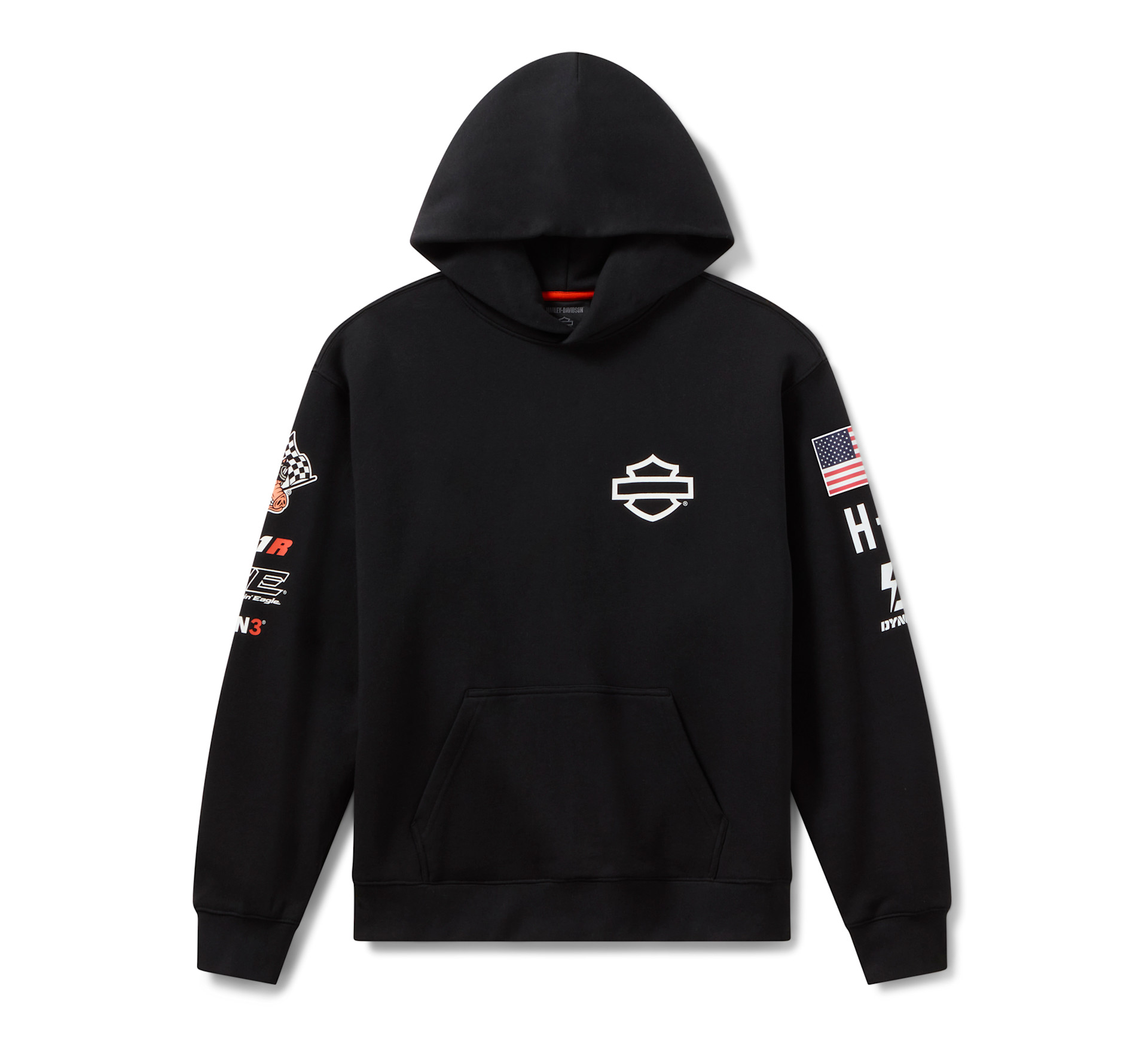
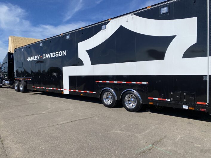
It’s rumored that Zeitz used his own money to hire a design firm for the new corporate identity. The redesign keeps the classic Bar & Shield but presents a “cleaned-up, modernized” version. Fair enough. The real shock was stripping the words “Harley-Davidson” and “Motorcycles” from the logo entirely. Many call this blasphemy. I certainly do.
This approach—removing the brand name from the logo—may have worked at Jochen’s former employer, Puma (where he successfully turned the company around), but it feels like an affront to Harley-Davidson’s fiercely loyal customer base. It comes across as if he’s embarrassed by the “Harley-Davidson” name and the motorcycle culture it represents. The new logo might suit a running shoe, but on a Harley-Davidson motorcycle, it lands as an insult.
Please, Mr. Artie Starrs (Harley-Davidson’s new CEO): Put “Harley-Davidson” and “Motorcycles” back in the logo. There’s no need to spend another million dollars. I can connect you with several talented graphic designers who would never have removed the name in the first place—and who will restore it for a fraction of what was spent. And after you handle that, take the company private.